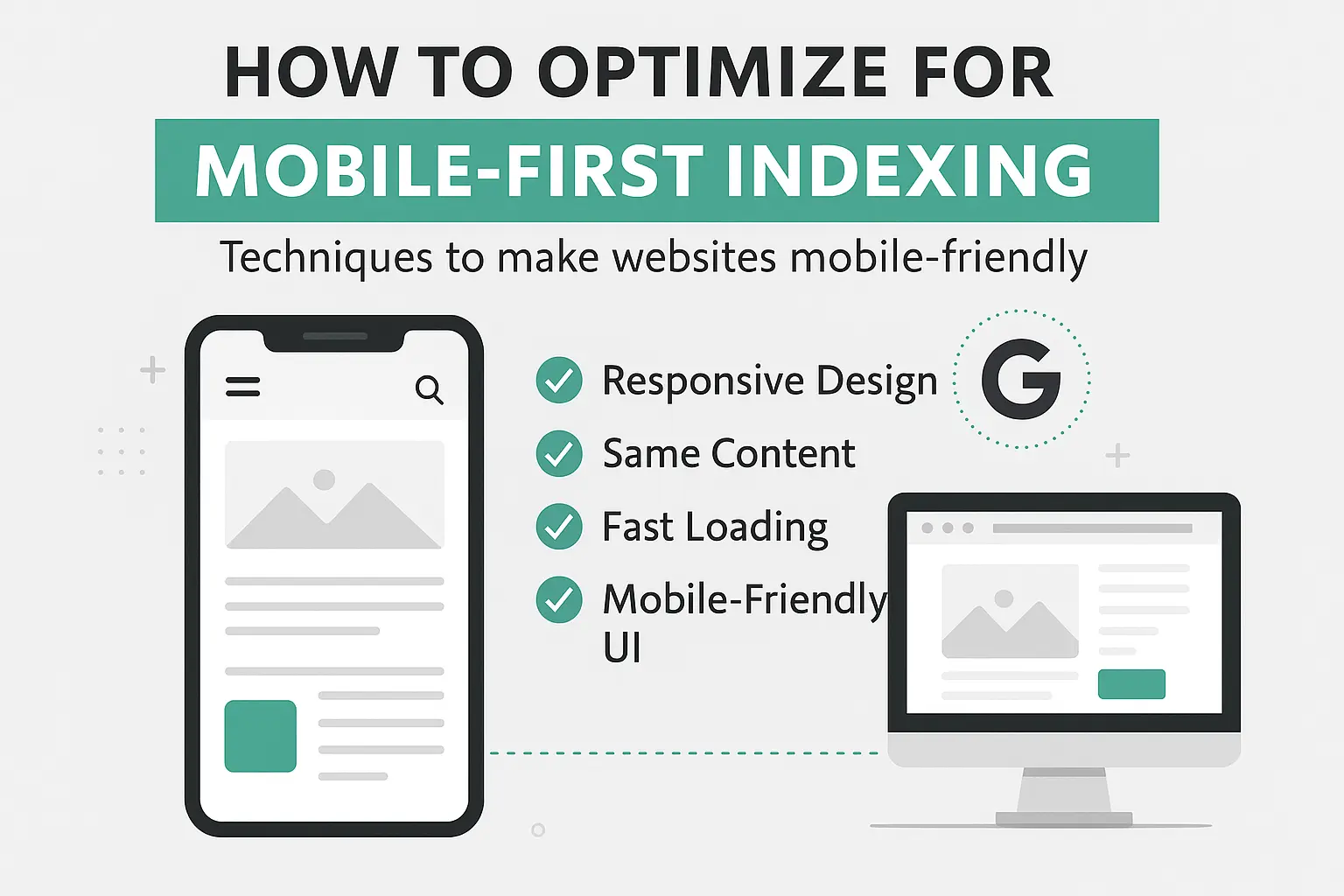
Techniques to Make Your Website Mobile-Friendly
Google has officially switched to mobile-first indexing, meaning it predominantly uses the mobile version of your website for indexing and ranking. If your site isn’t optimized for mobile, you’re likely losing out on traffic, visibility, and conversions.
In this post, we’ll break down what mobile-first indexing is, why it matters, and how to optimize your website to meet Google’s standards and deliver a seamless experience to mobile users.
📱 What is Mobile-First Indexing?
Mobile-first indexing means that Google primarily uses the mobile version of your website to determine where you rank in search results — even for desktop users. If your mobile site is lacking content or not well-structured, your overall SEO could take a hit.
Why It Matters
- Over 60% of web traffic now comes from mobile devices.
- A poor mobile experience = higher bounce rates.
- Google’s algorithm evaluates mobile usability as a ranking factor.
Techniques to Optimize for Mobile-First Indexing
1. Use a Responsive Design
A responsive design automatically adjusts to fit any screen size. This is Google’s recommended approach.
Tips:
- Use CSS media queries.
- Avoid fixed-width layouts.
- Test across multiple screen sizes.
Bonus: Responsive sites are easier to manage than separate mobile/desktop versions.
2. Ensure Content Parity
Make sure the same content appears on both desktop and mobile versions of your site.
Check for:
- Missing product descriptions or blog text
- Hidden navigation links
- Skipped meta titles or structured data
If Google can’t find the content on mobile, it won’t index it — even if it’s on desktop.
3. Improve Page Speed
Mobile users expect fast load times. Google also uses speed as a ranking signal.
Tips to boost speed:
- Compress images (WebP or AVIF formats)
- Minify CSS, JavaScript, and HTML
- Use lazy loading
- Choose a fast, reliable hosting provider
Try Google PageSpeed Insights to analyze and improve.
4. Use Mobile-Friendly Fonts & Buttons
Small text and cramped buttons frustrate users.
Best Practices:
- Minimum font size: 16px
- Touch-friendly button sizes (at least 48px tap targets)
- Adequate spacing between clickable elements
5. Optimize for Mobile Navigation
Mobile users don’t want to dig around.
Navigation tips:
- Use hamburger menus
- Keep menus short and clear
- Add a prominent search bar
- Avoid hover-based dropdowns
6. Eliminate Intrusive Interstitials (Pop-ups)
Pop-ups that block content can harm mobile experience — and rankings.
Allowed:
- Cookie notices
- Age verification
- Small banners at the top or bottom
Avoid:
- Full-screen pop-ups that appear on entry
7. Check Mobile Usability in Google Search Console
Google Search Console shows how your site performs on mobile.
Go to:
Search Console > Mobile Usability
Look for:
- Clickable elements too close
- Content wider than screen
- Text too small to read
Fix any issues Google reports.
Bonus: Structured Data & Mobile
Make sure structured data (schema) is also present on your mobile pages — not just desktop. This helps with rich snippets and voice search visibility.
Summary: Mobile-First Checklist
| Task | Done? |
|---|---|
| Responsive Design | ☐ |
| Same Content on Mobile & Desktop | ☐ |
| Fast Page Load Speed | ☐ |
| Mobile-Friendly Fonts & Buttons | ☐ |
| Clear Navigation | ☐ |
| No Annoying Popups | ☐ |
| Verified in Google Search Console | ☐ |
| Structured Data on Mobile | ☐ |
Final Thoughts
Optimizing for mobile-first indexing is no longer optional — it’s essential. By making your website responsive, fast, and user-friendly on mobile devices, you’re not just pleasing Google — you’re also giving your visitors the smooth experience they expect.
Start today. Test your site. Fix what’s broken. And stay ahead in the mobile-first world.
Leave a Reply